How To Choose A Colour Scheme For Your Logo Design - Art, Graphics & Video - Nairaland
Nairaland Forum / Science/Technology / Art, Graphics & Video / How To Choose A Colour Scheme For Your Logo Design (7625 Views)
Need A Logo Designer? Get Your Logo Done At A Ridiculously Cheap Price / Tips To Get The Best From Your Logo Designer / Design Your Logo, Flyer, Banner, Business Card For As Low As N1,500 (2) (3) (4)
| How To Choose A Colour Scheme For Your Logo Design by erad(m): 11:55am On Jan 10, 2018 |
Understanding the psychology of colours is vital to designing an effective logo, says Martin Christie of Logo Design London. The human mind is highly responsive to visual stimuli, and colour is one of the major defining factors in that response. On both a conscious and subconscious level, colours convey meaning – not only in the natural world but also within the artifice of our culture. Graphic designers need to harness the power of colour psychology to bring resonance to their designs – and in no field is this more important than that of logo design. The use of colour can bring multiple layers of meaning, from primitive responses based on millions of years of evolved instinct to the complex associations we make based on learned assumptions. Companies can use these responses to underline and accent their branding messages. And your success as a logo designer will be boosted if you have a thorough understanding of colour psychology. What different colours mean 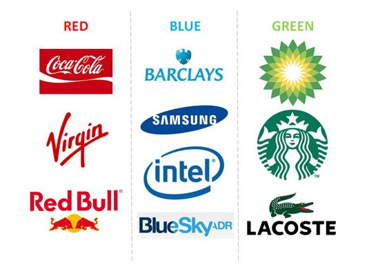 Big brands pick their colours carefully Every colour, including black and white, has implications for logo design. As a designers you need to pick your colours carefully to enhance specific elements of the logo and bring nuance to your message with the use of shade and tone. In general terms, bright and bold colours are attention-grabbing but can appear brash. Muted tones convey a more sophisticated image, but run the risk of being overlooked. More specifically, particular meanings are ascribed to different colours in society... Red implies passion, energy, danger or aggression; warmth and heat. It has also been found to stimulate appetite, which explains why it is used in so many restaurants and food product logos. Choosing red for your logo can make it feel more dynamic. Orange is often see as the colour of innovation and modern thinking. It also carries connotations of youth, fun, affordability and approachability. Yellow requires cautious use as it has some negative connotations including its signifying of cowardice and its use in warning signs. However it is sunny, warm and friendly and is another colour that is believed to stimulate appetite. Green is commonly used when a company wishes to emphasise their natural and ethical credentials, especially with such products as organic and vegetarian foods. Other meanings ascribed to it include growth and freshness, and it's popular with financial products too. Blue is one of the most widely used colours in corporate logos. It implies professionalism, serious mindedness, integrity, sincerity and calm. Blue is also associated with authority and success, and for this reason is popular with both financial institutions and government bodies. 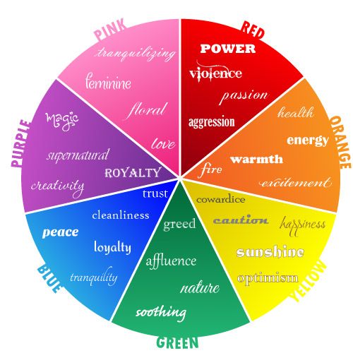 This diagram shows themes commonly associated with particular colours Purple speaks to us of royalty and luxury. It has long been associated with the church, implying wisdom and dignity, and throughout history it has been the colour of wealth and riches. Black is a colour with a split personality. On the one hand it implies power and sophistication, but on the other hand it is associated with villainy and death. More mundanely, most logos will need a black and white version for use in media in which colour is not available – and there is currently a trend for bold monochrome logos and word marks. White is generally associated with purity, cleanliness, simplicity and naiveté. In practical terms, a white logo will always need to stand in a coloured field to make it show up on a white background. Many companies will choose to have a coloured version and a white version of their logos; for example, the Coca-Cola word mark appears in white on its red tins and brown bottles but is used in red when needed on a white background. Brown has masculine connotations and is often used for products associated with rural life and the outdoors. Pink can be fun and flirty, but its feminine associations means it is often avoided for products not specifically targeted at women. These associations are not rigid rules, of course, but they're worth keeping in mind as you make your colour choices. Remember that the overall impact of your logo design will depend not on the colours themselves but upon how these interact with the shapes and text. Single or multiple colours?  Multiple colours are difficult to pull off, but can work To get the maximum impact of your chosen colour's coded message, I normally stick with a single colour when creating a logo design. That said, there are some very successful multi-coloured logos – think of Google, Windows or eBay. The implication of multiple colours is that these companies are offering a wide choice of products and services. The multiple colours used for the Olympic rings carry a message of diversity and inclusivity. A newly emergent trend in logo design is the use of mosaic patterns and tessellation. These naturally require several colours, ranging from contrasting brights to multiple shades of a single colour. Think globally If your client is a global corporation, choose your logo colour with care. There are cultural differences in the way colours are interpreted. For example, red is considered lucky in China, while white is the colour of death and mourning in India. There's a good round up of the cultural connotations of different colours here. Finally, don't put too much focus on colour choice. Consider that one in 12 of us suffer from colour blindness. Plus there's always the likelihood that any logo you produce for a client will end up be reproduced in monochrome, or even in different colours, as they see fit. So make sure your colour choice reinforces and enhances the design of your logo – but doesn't define it. How do you choose the colours for your logo designs? Share your views in the comments below! Words: Martin Christie Martin Christie is a creative director at graphic design agency Logo Design London. With many years of experience in branding and design, Martin often shares his experience with clients and graphic designers. For more insights visit the company's blog. Link: http://www.creativebloq.com/branding/choose-colour-logo-design-8133973 Also, kindly check out portfolios of Nairaland's best logo designers https://www.nairaland.com/3741851/nairaland-portfolio-logo-designers-2017 14 Likes 4 Shares |
| Re: How To Choose A Colour Scheme For Your Logo Design by thechase(m): 12:06pm On Jan 10, 2018 |
Jj |
| Re: How To Choose A Colour Scheme For Your Logo Design by lizzypro: 12:07pm On Jan 10, 2018 |
Ok |
| Re: How To Choose A Colour Scheme For Your Logo Design by seunmohmoh(f): 12:07pm On Jan 10, 2018 |
fp and no comment yet...i suspect foul play |
| Re: How To Choose A Colour Scheme For Your Logo Design by Zizicardo(f): 12:09pm On Jan 10, 2018 |
Thanks op. Very inspiring |
| Re: How To Choose A Colour Scheme For Your Logo Design by gergemam: 12:16pm On Jan 10, 2018 |
Issokay But a repetition thread... |
| Re: How To Choose A Colour Scheme For Your Logo Design by fghanni(m): 12:16pm On Jan 10, 2018 |
Noted! |
| Re: How To Choose A Colour Scheme For Your Logo Design by chaarly(m): 12:25pm On Jan 10, 2018 |
God please organize my life the way this OP organize this thread, and colour it with heavenly colours in Jesus name #It is too Late to Fail  1 Like |
| Re: How To Choose A Colour Scheme For Your Logo Design by Timiblanko(m): 12:31pm On Jan 10, 2018 |
Want to learn Corel draw and mixture of colours |
| Re: How To Choose A Colour Scheme For Your Logo Design by temmypotter(m): 12:38pm On Jan 10, 2018 |
when it comes to Colour psychology this days. I think it has to do with what can't work for a brand rather than the semantics. for example, it's obvious that pink can't work for a male fashion outfit but then any other Colour can, which negates how that colors like blue and purple are sidelined for masculinity. I have a preference for orange for my personal projects, which seems to work for all. so I think Colour psychology is just about what's not acceptable rather than a definitive template of what should be. not forgetting that every Colour has a bazillion shades 2 Likes |
| Re: How To Choose A Colour Scheme For Your Logo Design by globalfanz(m): 12:38pm On Jan 10, 2018 |
Knowledgeable |
| Re: How To Choose A Colour Scheme For Your Logo Design by Jaytecq(m): 1:26pm On Jan 10, 2018 |
hmmmm..... ok |
| Re: How To Choose A Colour Scheme For Your Logo Design by Crixina(f): 1:26pm On Jan 10, 2018 |
Well, colours..I think I need a logo right about now |
| Re: How To Choose A Colour Scheme For Your Logo Design by janeIBfashion(f): 2:04pm On Jan 10, 2018 |
Please who can help me do banner and business card for my new fashion shop? dm me if you have someone |
| Re: How To Choose A Colour Scheme For Your Logo Design by webngnews: 4:07pm On Jan 10, 2018 |
Noted |
| Re: How To Choose A Colour Scheme For Your Logo Design by KingBillionaire(m): 7:05pm On Jan 10, 2018 |
janeIBfashion: I just mailed you. I have someone who can help you. |
| Re: How To Choose A Colour Scheme For Your Logo Design by janeIBfashion(f): 7:08pm On Jan 10, 2018 |
KingBillionaire:ok i will respond to your mail at the perfect time |
| Re: How To Choose A Colour Scheme For Your Logo Design by Protocall: 8:04pm On Jan 10, 2018 |
For naija here wey we dey Color is just a colour just like age is just a number. Ko matter |
| Re: How To Choose A Colour Scheme For Your Logo Design by ImYourJude(m): 10:21pm On Jan 10, 2018 |
Graphic designer here, I design creative logos and much more... Contact me via signature. |
| Re: How To Choose A Colour Scheme For Your Logo Design by ImYourJude(m): 10:24pm On Jan 10, 2018 |
JaydeCreativity |
| Re: How To Choose A Colour Scheme For Your Logo Design by Jaytecq(m): 4:41pm On Mar 27, 2018 |
feel my stuff @jaytecq on Instagram dont forget to follow |
| Re: How To Choose A Colour Scheme For Your Logo Design by drealsheggs: 6:44pm On Mar 27, 2018 |
good info! Thanks. |
| Re: How To Choose A Colour Scheme For Your Logo Design by naijacartoon: 10:00pm On Mar 30, 2018 |
The business brand identity with regards to colour cannot be over emphasized. Most company spent heavily for this and the magic works like the master key that opens the padlock. Still indoubt then ask yello MTN and GREEN Glo among others. Well initially, i taught the topic was on colour as in colourscheme. All the same. NICE WORK |
(1) (Reply)
Insane Art Formed By Carving Books With Surgical Tools (pics) / Where Can I Do Wooden Frame For Pictures I Want To Enlarge / Results Of Web Banner Design Contest For Nairaland Ads
(Go Up)
| Sections: politics (1) business autos (1) jobs (1) career education (1) romance computers phones travel sports fashion health religion celebs tv-movies music-radio literature webmasters programming techmarket Links: (1) (2) (3) (4) (5) (6) (7) (8) (9) (10) Nairaland - Copyright © 2005 - 2024 Oluwaseun Osewa. All rights reserved. See How To Advertise. 27 |