Erad's Posts
Nairaland Forum › Erad's Profile › Erad's Posts
1 2 3 4 5 6 7 8 ... 82 83 84 85 86 87 88 89 90 (of 104 pages)
 Art, Graphics & Video › Re: Who Can Design For Ayayamedia.com by erad(mod): 5:41pm On Oct 07, 2014 Art, Graphics & Video › Re: Who Can Design For Ayayamedia.com by erad(mod): 5:41pm On Oct 07, 2014 |
I'm a graphic designer with nil knowledge web design. |
| Art, Graphics & Video › Re: Who Can Design For Ayayamedia.com by erad(mod): 4:04pm On Oct 07, 2014 |
Do you need the services of a graphic designer or a web designer?? |
| Art, Graphics & Video › Re: Six Tips For Designing A Memorable Brand by erad(mod): 12:46pm On Oct 07, 2014 |
felixchip:LOL... I dare not. Everything is fine on this end. |
| Art, Graphics & Video › Re: Six Tips For Designing A Memorable Brand by erad(mod): 12:16pm On Oct 07, 2014 |
| Art, Graphics & Video › Six Tips For Designing A Memorable Brand by erad(mod): 9:28am On Oct 07, 2014 |
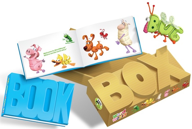
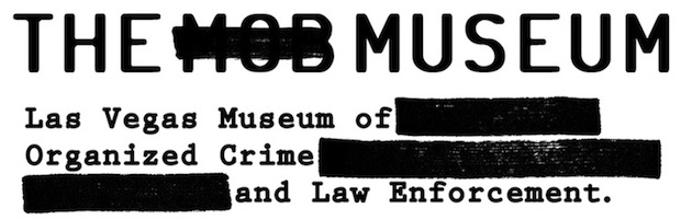
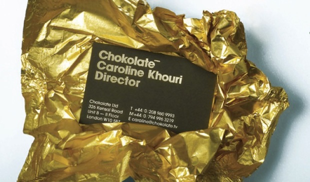
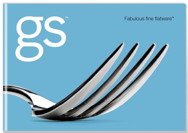
https://images.fastcompany.com/upload/Iceberg.jpg [b]When clients call on Yang Kim and Kevin Budelmann, principals of branding firm People Design in Grand Rapids, Michigan, they usually ask for a new logo. "But the logo is just the tip of the iceberg," Budelmann says. Usually, what they really want is a redesigned brand. Kim and Budelmann should know. Since leaving design jobs at Herman Miller 12 years ago, the pair has steadily made a name for themselves with clients such as Steelcase, Whirlpool and ArtPrize. And they've just summed up their learnings in Brand Identity Essentials. "You never see a logo by itself," Kim says. Instead, she says it's usually part of an overall brand that when well-executed takes into account everything from self- and outward perception to media landscape. For their new book, Kim and Budelmann culled their top 100 picks from 3,000 submissions of recent work around the world. "It's definitely our point of view," Kim adds. But with so many design books taking up shelf space these days--either design for designers or design-thinking for business types--Kim and Budelmann hopes theirs bridges that gap between the two camps and is accessible to both.[/b] Here's six lessons drawn from their book: [size=14pt]1. Know Your Customer[/size] https://images.fastcompany.com/upload/RP0335_6070A.jpg WordWorld by Siegel + Gale So many companies strike out because they don't do their homework. WorldWorld figured out their audience is young kids and kept that in mind with everything they rolled out, including relatable characters and bright colors. They also watched kids interact with the goods, to see what appealed. [size=14pt]2. Logo Flexibility[/size] https://images.fastcompany.com/upload/RP0335_5206%20mA.jpg Kapulica Studio by Bunch Can you have a constant logo that is still recognizable but also for its variety? Absolute Vodka perhaps? And also, Kapulica Studio. The K is constant but the treatment of it ranges form rigid to flexible - making variety also part of its graphic identity. [size=14pt]3. Wit [/size] https://images.fastcompany.com/upload/RP0335_5320A.jpg The Mob Museum, Wall-to-Wall Studios The authors say this submission is funny, appropriate and cool. By using humor and wit, the identity program puts the customer in the know. And making the visitor feel in on a joke heightens the experience for them. [size=14pt]4. Story[/size] https://images.fastcompany.com/upload/BunchA.jpg Chokolate by Bunch It's not such a stretch that a talent agency named Chokolate would play up their similarity to the word chocolate, but here, Bunch created an entire system of collateral that riffs on the idea. For example, business cards are wrapped in foil, leaving something memorable after chance encounters. [size=14pt]5. Cultural Symbols*[/size] https://images.fastcompany.com/upload/Cultural%20symbolsA.jpg Here, Kim and Budelmann selected marks that draw on cultural symbols to make their points. For example, familiar gaming and computer icons are starting points for the Game Investors, Omidyar Network, and DocDitto logos. Legal copyright and trademark symbols help define marks for Reloaded and C Plus. [size=14pt]6. An Aesthetic Niche[/size] https://images.fastcompany.com/upload/RP0335_4166A.jpg Gourmet Settings by Hahn Smith Design Effective logos often toy with the assumptions made by competing brands. Here, Hahn Smith design realized that tableware is often photographed flat and at a distance; so instead, they created a branding system that uses tight, monumental photography of small details. *Credits for composite image: 1. Mediterranean Games by Studio International 2. Japan-India Friendship Year 2007 by Christopher Dina 3.HimnesktÓ! by Einar Gylfason, Trausti Traustason 4. Omidyar Network by Hot Studio 5. Doc Ditto by Meta Newhouse Design 6. Reloaded by Cacao Design 7. C Plus by MINE 8. Game Investors by Volume 9. So Single by Cacao Design 10. Swiss Yachts by LOOVVOOL [Top image by People Design] Source: http://www.fastcodesign.com/1661946/six-tips-for-designing-a-memorable-brand |
| Dating And Meet-up Zone › Re: Obafemi Awolowo University... Rendezvous! by erad(op): 9:03pm On Oct 06, 2014 |
PweetyHitee:That's cool, nice to have you here. |
| Gaming › Re: Cool Awesome PS3 For Sale @ #30k Negotiable by erad(m): 2:08am On Oct 04, 2014 |
Can it go for 20k? and what are the issues it has? |
| Art, Graphics & Video › Re: 13 Ways Designers Screw Up Client Presentations by erad(mod): 11:40am On Oct 03, 2014 |
felixchip: Mister, you can't force words outta my mouth. I reply with whatever thing I wish to as long as I do not use the wrong words.Suit yourself bro. If the same situation repeats itself, I won't do anything differently. Nothing personal bro. |
| Art, Graphics & Video › Re: 13 Ways Designers Screw Up Client Presentations by erad(mod): 10:08am On Oct 03, 2014 |
felixchip: erad, you had no reason whatsoever to hide my comment.You are mistaken if you think I'll exchange words with you so you can elaborate more on playing victim. I will feel guilty if I didn't mete out the same treatment to similar post(er)s. It shows I have nothing against you, didn't even know it was your post until I went back to check after reading this comment. You should be the one to grow up and stop throlling on threads with "ok" all in a bid to keep space, |
| Art, Graphics & Video › 13 Ways Designers Screw Up Client Presentations by erad(mod): 7:34am On Oct 03, 2014 |
https://www.handmadeproductions.co.uk/wp-content/uploads/2013/05/Presentation-training.jpg [b]The hardest part of design is presenting work. You can’t even argue about this. I’ve seen people who did amazing work get up in front of a client and lay eggs. I’ve also seen people do alright work and work clients around their little finger. Optimally, you want to do good work and present it well. But I’d rather have a good designer who can present well than a great designer who can’t. In fact, I’d argue whether it’s possible to be a good designer if you can’t present your work to a client. Work that can’t be sold is as useless as the designer who can’t sell it. And, no, this is not an additional skill. Presenting is a core design skill. The first time I presented design to a client I absolutely choked. I put the work in front of them and stood there like an idiot. It was humiliating. The next time was a little easier. And the time after that, well, you get the idea. I have done every one of the things on this list. I’m sharing them with you in the hopes that they’ll spare you a humiliating experience or two. It’ll take time.[/b] [size=14pt]1. Seeing the client as someone they have to please[/size] Your client hired you because you are the expert at what you do. They are the expert at the thing they do. And you have been brought in to add your expertise to the client’s expertise to help them accomplish their goal. (If you’re presenting work and unclear on what that goal is we have a bigger problem than this article is going to address.) What they didn’t hire you to do is make them happy, or be their friend. Your decisions should revolve around achieving that goal, not pleasing the client. And while you should do everything in a professional and pleasing manner, never conflate helping the client achieve their goal with making them happy. They will ask you to do things that run counter, in your expertise, to achieving the goal. Your job is to convince them otherwise. In the end, they will be better served if you see yourself as the expert they believe they hired. And while this may result in some unpleasant conversations during the project, having unpleasant conversations is sometimes part of the job. Doing the wrong thing to avoid an unpleasant conversation doesn’t do either of you any favors in the long run. [size=14pt]2. Not getting off your ass[/size] This is your room. Your first job is to inspire confidence. Not just confidence in your work, but also confidence in your client that they hired the right person. Every interaction is an opportunity to reaffirm their decision in hiring you. Get off your ass and lead this meeting. You’ll seem more confident if you’re standing up. Your voice will carry better. Be the authority on design your client hired. Work the room. Walk to where you’re needed. Being on your feet will allow you to walk from person to person as they ask questions, simultaneously making you look more confident and allowing for more intimacy. It should go without saying that you dressed nicely and your hands are out of your pockets. Now run your presentation, sport. [size=14pt]3. Starting with an apology[/size] Do not start the presentation with an apology or disclaimer. No matter how much more you had hoped to present, by the time you get in that room, whatever you have is exactly the right amount of work. Any resetting of expectations should have been handled before the meeting. Obviously, don’t do anything that you’ll need to apologize for. Like showing up late. Or forgetting an adapter. Or spilling coffee on your new white shirt. And if you’re really not prepared for the meeting, then better to cancel it than to waste your clients’ time. (You can get away with that exactly once during a project.) But by the time you are in that room, be ready to present strong and to exude confidence. [size=14pt]4. Not setting the stage properly[/size] You have gathered all of these busy people together. They probably have other things to do. So let them know why they are in this presentation. Let them know they are a necessary and important part of the conversation. People like feeling needed. And they hate having their time wasted. Start the meeting by thanking them for their time. Let them know what their role will be. Why they’re here. What you’ll be showing them. And what kind of participation you need from them. This is your opportunity to make them feel like the experts they are. Let them know what stage of the project you’re in. Give a very brief reminder of what the last stage was, how it helped you get to this stage, and how the presentation you’re in now will help move the project forward. [size=14pt]5. Giving the real estate tour[/size] Never explain what they can obviously see right in front of them. They can all see the logo on the top left. They can all see the search box. There is absolutely nothing more boring than a designer walking a client down the page, listing all the things they can already see. Pull up. You don’t sell a house by talking about sheetrock. You sell it by getting the buyer to picture themselves in the neighborhood. Sell the benefits of the work. Sell how the work matches to the project’s goals. Sell how their new site is going to crush their competitors and make them all rich beyond their wildest dreams. And while every decision on that page should have been made with the benefit of data and good research, people are irrational creatures who don’t make decisions based on data and research. They make them based on stories. So find your story and tell it. [size=14pt]6. Taking notes[/size] You’re too busy giving a presentation to take notes. You’re on stage. Ask someone else to take notes for you. And then post them for the client to review after the meeting so you can agree you heard the same thing. [size=14pt]7. Reading a script[/size] I’m already asleep. You need to convince your client that you’re excited about what you’re showing them. Let’s be honest here. This is a show. There’s a little smoke and mirrors. There’s a little Barnum. Not so much that it’s a clown show, but enough that you’re building up some excitement. Work towards a crescendo. There’s little difference between a designer presenting work and a DJ working a crowd. You are selling design. So have your facts straight. Have your homework done. Have your data at hand. Know why you’ve made the choices you’ve made. Have notes nearby if you need to refer to them, but you shouldn’t be sitting near your notes anyway. (Remember, you’re walking the room.) But work all of these around an exciting narrative. And practice it enough that you know it going in. Be a scientist when you work, and a snake charmer when you present. [size=14pt]8. Getting defensive[/size] You are not your work and your work is not you. It is not an extension of you and it is not your personal expression. It is work product done to meet a client’s goals. The client is free to criticize that work and tell you whether he believes it has met those goals or not. You are free to disagree with him. And you are expected to be able to make a rational case for those disagreements. But you are not allowed to get all butthurt about it. This is a job. There’s a difference between defending the work, and getting defensive. The latter is personal, it happens when you’re seeing the criticism as a reflection of yourself. Guess what, sport? Good people do bad work sometimes. So when the client starts critiquing the work, listen to what they are saying. Don’t feel like you have to defend all of their decisions then and there. You also don’t have to promise them anything then and there. Sometimes it’s best to sit on it for a while. It’s perfectly fine to say something like “That’s interesting feedback. Let me think about it.” [size=14pt]9. Mentioning typefaces[/size] Clients don’t give a shit about typefaces. And if they do, they’ll ask. The thing I’ve heard most often from clients is “I don’t know anything about design.” (They’re wrong, btw.) This is their way of telling you they’re uncomfortable. They hate feeling uncomfortable, and you do too. It’s on you to get them back into their comfort zone, which is the thing they’re experts in — their business. Which is great, because that’s something you are not an expert in. It’s great to have one in the room. There’s already a design expert in the room — you! So when presenting the work, talk about it in terms that relate to their business. Talk about how the decisions you made as the design expert match up to the goals of the project. Then your client can judge those as the subject matter they are. But the color, the type, the design shit — you’ve got that. If you ask them for their opinion on design don’t come crying to me when they give it to you, and you’re all like, “They don’t know anything about design!” They warned you! [size=14pt]10. Talking about how hard you worked[/size] The worst feedback you can get from a client is “Wow. It looks like you worked really hard on this!” Stop using your work like a time card. If you did it right, it looks like it was effortless. It looks like it’s always existed. And the client will probably be irritated that they paid you for 30 hours of work to do something that looks like it took an hour. Which it did. They’re just not seeing the 29 hours of bad design that got you to that one hour of good design. And for the love of god, please don’t show them those 29 hours of bad design. A presentation is a shitty place for a sausage-making demonstration and you’ll just come across as a defensive, unsure person needing validation. Sell the f*ck out of that one hour of good design — most people can’t do ten minutes of it. [size=14pt]11. Reacting to questions as change requests[/size] “Why is this green?” “I can change it!” I don’t really need to go any further into this one, do I? Just answer the question as asked. You should be able to answer that. [size=14pt]12. Not guiding the feedback loop[/size] There’s only one question worse than “What do you think?” (It’s coming up.) Ever hear a designer scream about a client giving them the wrong type of feedback? I have. At which point I ask them if they told the client what kind of feedback they were looking for and they just pull the panda hat over their head to hide their anger. Most clients have absolutely no idea what kind of feedback you’re looking for. And there’s no reason why they would. They do not do this every day. They don’t have the training that you do. Nor do they need it, because guiding them towards the right type of feedback is part of your job. (Anything that helps you do your job is part of your job.) Know what you want before you call the meeting, and then guide the meeting toward that goal. So during the presentation feel free to slap your hands together and say “This is the kind of feedback I’m looking for today!” Here are some suggestions for guiding questions: Does this reflect your brand? Does this reflect your users’ needs as we discussed in the research? Does this reflect your current ad strategy? Keep the feedback questions about things that they’re the subject matter expert in. I have absolutely no doubt that they’ll give you feedback on color and type and all the other stuff you didn’t want anyway. Which you should take with a grain of salt. But that other stuff is the feedback you can’t move forward without. Which brings us to the absolute worst question of all: [size=14pt]13. Asking “Do you like it?”[/size] Dear sweet lord in heaven above and all his angels, you just gave away the farm. They are no longer viewing you as an expert. You are no longer their equal in expertise. You are no longer the person they feel comfortable enough writing a check to. Even if they don’t realize it, all of these things just happened. You are now reduced down to a small child showing your dad a picture of the cat and hoping he deems it worthy enough to put on the fridge anchored by his magnetic Las Vegas bottle opener. The client didn’t hire you to make something they liked, and something they like may not be the thing that leads to their success. So do not conflate the two. This point needs to be driven home from the very beginning of the project. And nowhere is this message more undermined than using language that leads them down a subjective path. …and one weird trick that you won’t believe works every time. Learn the client’s goddamn name. Source: https://medium.com/@monteiro/13-ways-designers-screw-up-client-presentations-51aaee11e28c 24 Likes 2 Shares |
| Art, Graphics & Video › 5 Tips For Successful Business Logo Design by erad(mod): 5:56am On Oct 01, 2014*. Modified: 6:30am On Oct 01, 2014 |
https://www.artlandia.com/wonderland/glossary/imgs/PatternDesign.jpg Designing a new logo can be a confusing process for business owners. There are many options to consider – colors, font selection, images, size, shape, etc. In this post, we explain the five most important items to make your business logo design successful. [size=14pt]Simplicity[/size] Keep it simple. That’s pretty solid advice for a lot of things, including business logo design. If you’re looking to capture the attention of potential customers and remind current ones of your reach, a busy or cluttered logo isn’t going to do your business any favors. Some of the most successful logos have been the simplest. We’re talking about clean, bold lines without a lot of elements to distract the eye or detract from the impact of the message. The “gold scallop” of Shell Oil and the red and white “bullseye” of Target retail stores are excellent examples of simple designs that are bold, identifiable, and evocative of the brand they represent. https://99designs.com/customer-blog/wp-content/uploads/2013/09/shell-logo-624.png https://integrityreporters.com/wp-content/uploads/2014/07/gtbank.jpg Originality The painter Edouard Manet was unfortunate enough to be a contemporary of the more highly regarded Claude Monet, to the point that Manet was asked to show his work only to learn that the gallery had believed they were contracting with Monet. Ouch! The last thing you want from a company logo is to have it mistaken for that of a competitor. So when considering logo design, it’s important to keep it original. Look at what’s out there and find an opening for something new. When looking to avoid brand confusion, consider the color, shape, symbolism, and flow of your design. The color choices in the Taco Bell logo represent a good example of one way to make a recognizable object stand out as an original brand logo. https://www.faceofmalawi.com/wp-content/uploads/2014/08/Airtel-Rising-Stars1.jpg [size=14pt]Memorability[/size] What do the “running dog” of Greyhound bus lines and the “bitten apple” of Apple computers have in common? They’re memorable. These days the average consumer is flooded with commercial messages. Everything from TV ads and roadside billboards to web banners and pop-up ads on game apps seems to be screaming at us with a sales message. Eventually, amid the high volume of commercial communication, all but the most memorable messages become noise that the brain learns to filter out. So how do you ensure that your logo gets through that mental filter? Choosing a design that’s bold enough to be both memorable and instantly recognizable is one key to success. https://connectnigeria.com/articles/wp-content/uploads/2014/01/dangoteLogo-599x275.jpg [img]http://3.bp..com/-LdF0x2PKsds/T7EQIk8BlUI/AAAAAAAAB-Y/CcNNVpgZO0g/s320/Etisalat-logo.jpg[/img] [size=14pt]Clarity[/size] When selecting a company logo, know your customer audience—both who they are and what they expect from you. Ask yourself what your company logo says about your business. Does it emphasize power, tradition, speed, flexibility, health, fun, or connectivity? Any of these attributes (and many others) can be the central message of an effective design. Ford Motor Company, for example, has maintained its famous “blue oval” for a century—reinforcing the Ford name as an originator in automotive technology. On the other hand, the famous Nike “swoosh” emphasizes speed and forward motion. Six Flags uses a playfully nostalgic mid-century design to remind its audience that childhood memories are made at amusement parks. In each case, the logo evokes a mood—a positive feeling that is linked to the company’s core message. https://royaltimes.net/wp-content/uploads/2013/09/Tinapa.jpg [img]http://citizenjuwon.files./2013/02/7365ondo.gif[/img] [size=14pt]Brandability[/size] A logo is your company’s public face, so it must be easily transferable to any medium that bears your brand—whether it’s a fleet of trucks, packaging, web ads, or social media, or all of these. An effective logo is easily recognizable at a glance, both in color and in black and white, and in any size. A good logo works as both a highway billboard and a Twitter avatar. If your logo relies on fine print, you have a problem. Some examples of company logos that demonstrate brandability in any form are the McDonald’s “golden arches” and the Target “bullseye.” Think about all the formats that you use to connect with customers, and be sure that the logo design you select works well with each. https://www.humanipo.com/wp-content/uploads/2013/07/konga_logo.jpg [img]http://lisagurley.files./2013/01/mcds.jpeg[/img] Source: http://99designs.com/customer-blog/5-business-logo-design-tips/ [size=14pt]Check the portfolio(s) of Nairaland logo designers here; https://www.nairaland.com/1823110/nairaland-portfolio-logo-designers[/size] 1 Like |
| Dating And Meet-up Zone › Obafemi Awolowo University... Rendezvous! by erad(op): 5:30am On Oct 01, 2014 |
Hi guys, created this thread for past, present and future OAU students/staff to meet up and at least share stories, gists and ideas. For those needing assistance and those who can offer it. Lets get to know each other and mingle. We are a people of great pride and intellect, let's reason together. I'm Oluyomi, Economics department... And its my pleasure to welcome you all. |
| Art, Graphics & Video › Re: Cost Of Logo Design by erad(mod): 8:52pm On Sep 26, 2014 |
cascade01: Thanks for your comment, i am quite aware what PNG is, my question is quite simple and specific! I do not require source files and no need to pay more for it. I need a simple logo to use for a one off....Ok then, I guess you understand what you want. |
| Art, Graphics & Video › Re: Cost Of Logo Design by erad(mod): 5:57pm On Sep 26, 2014 |
First, PNG is one of the formats but that's not what you should be requesting for because its use is limited. Request for the source vector file as well as PNG so you won't have to be running after the designer when you need the source file or pay for another one if something happens to the designer. |
| Art, Graphics & Video › Re: The Biggest Mistakes Logo Designers Make by erad(mod): 5:18am On Sep 26, 2014 |
feldido: What about this?That really can't be called a logo for so many obvious reasons. |
| Art, Graphics & Video › Re: The Biggest Mistakes Logo Designers Make by erad(mod): 5:17am On Sep 26, 2014 |
popoolagroup: @erad drop your contact we got something to do.My contact is on my profile. You can give a call on 07058476216. Thank you. |
| Art, Graphics & Video › Re: The Biggest Mistakes Logo Designers Make by erad(mod): 8:11am On Sep 25, 2014 |
bokunrawo: Hummm,BMW na thiefThe other company is the culprit here 2 Likes |








1 2 3 4 5 6 7 8 ... 82 83 84 85 86 87 88 89 90 (of 104 pages)