Erad's Posts
Nairaland Forum › Erad's Profile › Erad's Posts
1 2 3 4 5 6 7 8 ... 73 74 75 76 77 78 79 80 81 (of 104 pages)
 Art, Graphics & Video › Re: Nairaland Portfolio For Logo Designers 2018 by erad(mod): 9:57am On May 21, 2019 Art, Graphics & Video › Re: Nairaland Portfolio For Logo Designers 2018 by erad(mod): 9:57am On May 21, 2019 |
okorro1:My number is on my signature, kindly send me a message on whatsapp. |
| Art, Graphics & Video › Re: 10 Critical Mistakes To Avoid When Choosing A Logo Designer For Your Startup by erad(mod): 1:32pm On May 04, 2019 |
Also... Try to make sure 'cost' doesn't push you into the hands of mediocres. Whatever is worth doing at all is worth doing well. If you can't afford a good designer at the moment, be patient and save up rather than rushing to get any logo design anyhow by any means. A bad identity can ruin any start-up before it even kick-starts. Be aware. 3 Likes |
| Art, Graphics & Video › 10 Critical Mistakes To Avoid When Choosing A Logo Designer For Your Startup by erad(mod): 1:16pm On May 04, 2019 |
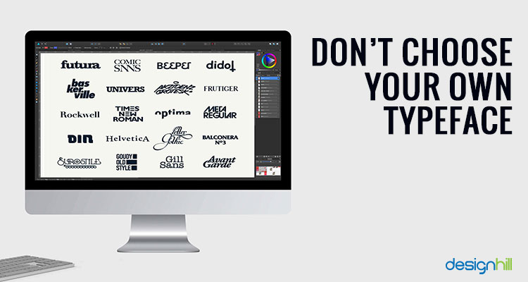
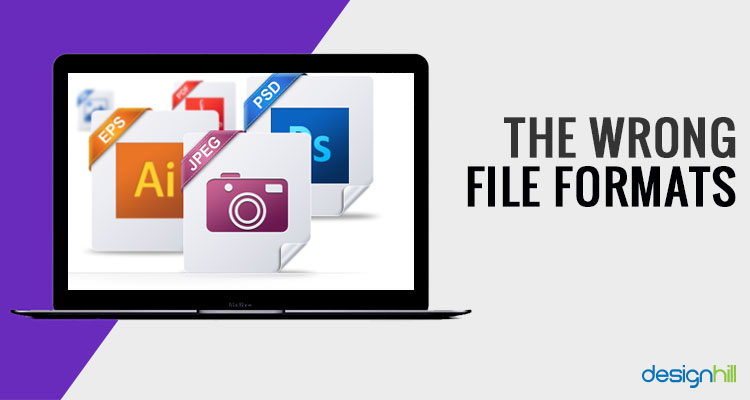
https://www.designhill.com/design-blog/wp-content/uploads/2018/05/Logo-Designer-768x439.jpg The service of a logo designer is more important to a start-up if it wants to make a solid beginning in the target market. Picking an efficient and experienced designer to create your start-up logo is crucial to give your new business a good image amongst your audience. Such a designer knows the psychology of colours, fonts, and other elements to create a memorable logo. Only such a logo can engage your target audience with your new business. Top 10 Tips To Hire A logo Designer For Startup Business 01. Hiring A Friend You may have a cousin, niece or friend of a friend with a decent amount of skill in graphic design. But this isn’t the same thing as being a professional in the field of logo design or web design. Choosing a friend to create your logo may seem like both the most economical and the most comfortable option. But you’ll pay for it in the long run. https://www.designhill.com/design-blog/wp-content/uploads/2015/05/website-design.jpg The process of creating the “perfect” logo strain the relationship with the friend or family member doing the work for you. But the cost of a much-needed rebranding effort a couple years down the road could be astronomical. Business Insider recommends seeking out professional designers through established design platforms rather than the grapevine. 02. Overdoing It There comes a time when you need to let go of the logo designing process and let your new logo ideas & inspiration fly. It’s easy to spend months nitpicking every aspect of the design. This process should be undertaken with the utmost care considering the importance of a logo in your business image. But going in circles can actually end up taking the “streamlining” process too far. It can even ruin what could have been a great design. https://www.designhill.com/design-blog/wp-content/uploads/2015/05/logo-design.jpg 03. Not Knowing What You Want It is up to the designer to translate your brand image into a single highly flexible piece of design. Still, you need to do your part to make their job easier. Figure out the kind of company values you want to portray through your logo. https://www.designhill.com/design-blog/wp-content/uploads/2015/05/brand-identity.jpg You should also have a colour scheme in mind if possible. Any ideas you have about the design should be discussed with a logo designer to ensure the designer has the style you’re looking for. This is essential to creating a logo and brand identity. 04. Don’t Choose Your Own Typeface It’s easy to get attached to a font. There are already hundreds of fonts all over the Internet. However, Creative Blog reminds us that typefaces evoke a certain ambience and image, so the selection should be primarily up to the designer. https://www.designhill.com/design-blog/wp-content/uploads/2015/05/online-brochure-design.jpg But make sure that the fonts you choose for your logo are not different from the fonts you already have on your website design or online brochure design. This is an important step to take for brand consistency. 05. Not Getting Details When you look through the portfolio of a designer, it’s not good to take everything at face value. When reviewing a designer’s portfolio, make sure you ask the designer about the role he/she plays with an agency and large-scale projects. For example, a designer’s portfolio or bio-data reveals an impressive list of work with Sony or Samsung. But if that work was literally slapping their pre-existing logos onto a photo was chosen by the graphic design marketing director, that doesn’t show a lot of skill. https://www.designhill.com/design-blog/wp-content/uploads/2015/05/graphic-designer.jpg After portfolios have been sent, questions have been asked and review is underway, it’s a matter of looking over the portfolio carefully to avoid other possible pitfalls. 06. Everything Looks The Same The first portfolio pitfall is over-consistency. Thankfully, it’s easy to pick out. If you find a portfolio of logos that are almost all circles or rectangles, always use the same set of typefaces or the same colour palette, move on to the next option. https://www.designhill.com/design-blog/wp-content/uploads/2015/05/logo-design-1.jpg 07. No Consistency Too much of the same thing can ruin a good portfolio. If in the portfolio, the quality and styling of designs vary too dramatically from one piece to the next; this denotes a lack of understanding of composition, the design process. If the portfolio has every logo having a new experiment in layer styling, you want to look for someone else. https://www.designhill.com/design-blog/wp-content/uploads/2015/05/No-Consistency.jpg 08. Colour Choice Seem Off Colour has meaning! Especially in logo design, colour choice is the key to evoking the desired emotion and ambience. Such a colour choice helps target the audience. According to Smashing Magazine, warm colours evoke passion and energy, while cool colours are relaxing and create a sense of trustworthiness. If your prospective logo designer is using colour choices that seem wrong to you, they probably lack the knowledge of colour theory you need to succeed. Try the next candidate. https://www.designhill.com/design-blog/wp-content/uploads/2015/05/logo-design-2.jpg Remember that choice of the right colours is important not just to create a logo, but all graphic designs. Even when you need a brochure design or a social media page design, a perfect selection of colours matters a lot. 09. The Wrong File Formats JPEGs and PNGs are nice, but you should also have your logo in a vectored EPS format. This file format can be scaled up infinitely to place your logo on everything from business cards to billboards. Ask your designer what formats they offer before you get started; you can even ask for them to be listed in your contract. https://www.designhill.com/design-blog/wp-content/uploads/2015/05/File-Formats.jpg 10. Dated Designs Everywhere Logo designers, more than anyone else, need to be up to date with all the newest trends. Even they should be able to foresee which trends will hang on and which will fall by the graphic design wayside. An updated logo will make your business look good in your niche market and amid your audience. When it comes to business, especially start-ups, your brand’s credibility is everything. Don’t let poor logo design ruin your brand image. Make sure the face of your start-up is the face you want by choosing a pro that works for you. https://www.designhill.com/design-blog/wp-content/uploads/2015/05/graphic-designer-2.jpg Conclusion To choose a right logo designer, first know what precisely you want from your logo. The style, choice of colours, brand message etc must be clear to you. Then, evaluate different design portfolio and pick the one that has quality design work with great consistency, right colour choices etc. Source: https://www.designhill.com/design-blog/critical-mistakes-to-avoid-when-choosing-a-logo-designer-for-your-startup/ For Nairaland designers' logo portfolio... Also check: https://www.nairaland.com/5076709/nairaland-portfolio-logo-designers-2019 7 Likes 4 Shares |
| Art, Graphics & Video › Re: Nairaland Portfolio For Logo Designers 2018 by erad(mod): 7:27pm On Apr 08, 2019 |
| Art, Graphics & Video › Re: Incredible ART with Drinking Straw by erad(mod): 3:10pm On Mar 25, 2019 |
Hi, Kindly tell her to post directly from her account and then mention me on the thread. Thank you. 1 Like |
| Art, Graphics & Video › Re: Nairaland Portfolio For Logo Designers 2019 V1.0 by erad(mod): 12:04pm On Mar 14, 2019 |
sureteeboy:I considered it but people will take undue advantage of it. 1 Like |
| Art, Graphics & Video › Re: Nairaland Portfolio For Logo Designers 2019 V1.0 by erad(mod): 9:58am On Mar 14, 2019 |
webincomeplus:Yes I do, I design ALL types of logos. |
| Art, Graphics & Video › Re: Nairaland Portfolio For Logo Designers 2019 V1.0 by erad(mod): 12:35pm On Mar 13, 2019 |
Going first... 11 Likes 1 Share
|
| Art, Graphics & Video › Nairaland Portfolio For Logo Designers 2019 V1.0 by erad(mod): 12:32pm On Mar 13, 2019 |
https://image.shutterstock.com/image-vector/portfolio-word-banner-vector-illustration-260nw-1200433627.jpg Hi guys, We are here again to provide members of Arts and Graphics section on Nairaland an opportunity to showcase their works, logo designs specifically. This is not for comparison purposes, to criticize, oppress, or brag. Just a thread where designers can exhibit their logos and members, guests, fellow designers and potential clients can access, admire, constructively criticize your works and know how to contact you for your services now or later. It can serve as a mini portfolio for the designers. It's also to prove that Nigerian designers are up to international standards and should be accorded their due respect. Just like the last time, same rules apply, for organization purposes. *All designers will have a maximum of four(4) attachments only. *Each attachment will have a 800px by 200px dimension. *The first attachment must carry the designer's logo only as well as his/her contact details if he/she thinks it's necessary. *The other three(3) attachments will contain maximum of four(4) logos each for clarity purpose in no particular order. *All designs submitted must be the genuine work(s) of the designer submitting it, any forgery or false claims will lead to deleting the affected post and appropriate actions will be taken against the culprit. *People should try to avoid asking for a designer's price, number, mail, etc on the thread. Their contacts will be on the first image they upload, if they follow the instructions. Any such comments will be promptly removed. *While I understand some people have no appreciation for this kind of thing, I'll appreciate if we all can respect each other and be as civil as possible. We owe each other that much. Designers are advised to pick out the best of their designs to better impress visitors and potential clients. No text here except for a brief greeting, just your designs speaking for you. Have fun. Thank you. 6 Likes 2 Shares |
| Politics › Re: Photos From Abdulsalami-led Peace Committee Meeting With Atiku, Obi In Abuja by erad(m): 8:43am On Mar 01, 2019 |
Stillthebest:I guess english is you guys' problem... How has saying someone looks spent warranted all these grammatical irrelevancies? Saraki looks 'spent'. It's not an insult, just an observation. Y'all making a mountain out of a mole hill. 1 Like |
| Art, Graphics & Video › Re: My Cartoon Sketch Titled : Dead Government by erad(mod): 7:25am On Jan 19, 2019 |
Riqueleme:Bro, why not post all your art works under a single thread, rather than opening multiple threads in a days for the same category of designs? 1 Like |
| Agriculture › Re: Make Your Business Stand Out Today - Win More Clients Fast ! by erad(m): 5:37pm On Dec 28, 2018*. Modified: 10:39am On Dec 29, 2018 |
kunleweb:Thank you. |
| Art, Graphics & Video › Re: 10 Reasons Why A Small Business Logo Is Important by erad(mod): 12:15am On Dec 28, 2018 |
bosunjohns:Kindly contact me on 07058476216. Thanks. |
| Art, Graphics & Video › 10 Reasons Why A Small Business Logo Is Important by erad(mod): 4:34pm On Dec 26, 2018*. Modified: 5:08pm On Dec 26, 2018 |
[img]http://1.bp..com/-FkLU1KWQOBM/Tu-1m-A4IPI/AAAAAAAAC_E/KXXDnE-S4JM/s400/seasonal.png[/img] We all know the Nike logo, but did you know that its well-recognized swoosh cost just $35? Or that the first logo of Twitter cost just $15? Think about all the most recognizable brands. Now visualize their logos. It’s easy, right? That’s because logos go way back to the start of the marketing era. Consider Apple without the apple or Nike without its swoosh. A small business logo is probably the most critical tool in your product promotion arsenal. It’s not just a random mark. It provides your small business with an identity that represents your core values and your mission. If executed properly, that identity can immediately sell your brand to prospective customers. A poor small business logo design will turn your customers off. Having none at all is even a bigger marketing mistake. https://assets.entrepreneur.com/content/3x2/2000/20160309065812-shutterstock-236672323.jpeg Your Logo Isn’t Your Brand Before we look at 10 reasons why it’s vital to design a logo for your business, let’s get one thing straight: Your logo represents your brand but it’s not your brand. Through color, business logo fonts, and logo design, it portrays your business’ personality–just like the attire you’re wearing conveys who you are. The clothes you wear aren’t you, but they reveal your character and personality to others. Therefore, developing your logo should take a bit of thought and time. It’s a strategic effort that’ll be pivotal to all of your advertising in the future. It shouldn’t be treated lightly. So Who Are You? Even if your business is very small, it needs an identity. Your target market should know who you are. A great logo is one of the best ways to achieve that. It can attract your target audience and differentiate you from competitors. Without further ado, here are 10 reasons why your small business should have a logo. First Impressions can Make or Break Your Business Your logo is the face of your company and as they say, “You only have one chance to create a first impression.” Do you want your business name rendered in plain text rather than an eye-catching design? You wouldn’t want that to be the first thing potential customers see, would you? Nope. You probably want your customers wowed instantly. A logo is a great way to make an impression on your potential customers from the beginning. They’ll have ages to know you better in the future. In the beginning, having a logo says a lot about your business. Gets You Recognized A business logo should be easy to recognize in small and large print. You want your customers to recognize your business with ease, whether it’s in a digital advert on someone’s phone, it’s embroidered on a tee, or it’s on a billboard. Your logo should have a simple design and shouldn’t compete with the logos of other businesses. You don’t want to launch an advertising campaign with something that customers might confuse with a trademarked logo. And you should know that having a logo that looks like a trademarked one could land your new business in legal hot soup. Popular logos are known the world over, no matter the message around it. Fosters Brand Loyalty Apart from boosting brand recognition, your logo can also be an effective tool for cultivating brand loyalty. Your logo can give consumers something to cling to, both physically and mentally, if they follow your business. Based on your brand, it’s possible to distribute promotional items or merchandise that display your logo. Lots of businesses give away free pens and business shirts with the logo prominently displayed on them. Although this can be useful for getting new customers, it also can be an amazing way to build appreciation and loyalty to your brand. Builds Trust in Your Business As far brand identity is concerned, logos do almost all the running. You can create trust among your customers with a logo that positively communicates with them. For instance, if your target customer is an ice skating young person, your logo should not look like it’s selling to older adults. Senior citizens might prefer a logo with a more conventional serif font. On the other hand, the more modern sans-serif fonts might appeal to the youth. Serif fonts are amazing if you want to convey strength and longevity but sans-serif fonts are friendlier. The same case applies to your choice of color. Blue stirs up trust. Excess yellow might make your customers anxious. The emotions provoked by color are an entire science, and you can capitalize on this information to create a logo design that makes customers feel great about your business even before they’ve talked to you. Proof of Your Professionalism News just in! There’s no real business without a logo. The truth of the matter is that although logos are simply a small part of your business’ day-to-day operations, they’re still critically important. In the society we live in, potential consumers have acquired certain expectations. They imagine that a reliable and professional business must have a logo that stands out. By having your logo professionally designed, you automatically stand out from the rest of the competitors that might have developed their design in a hurried fashion, failing to fully appreciate the value of brand development. Reveals Your Identity One of the reasons why the Nike logo is so successful is the fact that it reflects Nike’s business. The Greek goddess of victory is behind the Nike name, and the swoosh symbolizes the pace and flight-like ability one might have while wearing Nike shoes. Other logos of well-known brands clearly communicate what the business does, which helps customers know what they can expect from the company immediately. The logo of Swirl frozen yogurt is a little yogurt swirl. This prevents customer confusion. And there is a good reason why most top logos feature a certain image. Creates an Emotional Connection Again, visualize all the most famous logos. How do they make you feel? Logos are often the first thing that builds the emotional connection you’ve got with your favorite brands. Consider this data from Marketing and Entrepreneurship: 80 percent of consumers think that colors boost brand recognition 93 percent of purchasing decisions are made based on visual perceptions 7% of customers say they buy a product because of color This is why your small business needs a logo that’s specially designed to draw a positive reaction from customers. If customers connect with your logo, they’re unlikely to forget your company. And if they’ve got good memories of your business, they’re more likely to buy your products or services. On the other hand, if your logo is poorly designed, this can be bad news for your bottom line. Again, you create your first impression with your logo and as the saying goes, “You’ve only got one chance to impress.” Set Yourself Apart with Your Small Business Logo No matter the product or service you sell, you’ll have lots of competitors. That a fact. So how can stand out from your competitors? Well, a logo is one effective tool that will help you do that. You only have so many chances to prove yourself. A logo represents your business visually and is a strong way to leave an impression and foster your brand identity. A logo shows your consumers that you care about them and want to be the best in your area. Creates Consistency We’re now in an era where businesses exist on various platforms, including websites, blogs, Facebook, Twitter, Instagram, leaflets, info packs, business cards, etc. This means your brand identity should be rubber-stamped everywhere. Here, some sort of consistency is critical, ensuring that your business is clearly and properly represented wherever it appears. This kind of consistency will ensure you keep up that professional image and enhance the value of that strong brand loyalty that you need to build. Raises Expectations After being used to the Apples and the IBMs and Nikes of this world, we’ve come to expect any business to have some kind of professional look in the shape of a proper logo at the very least. If a business does not have this essential asset, why would anyone do business with them? Without a logo, all these points have been cast aside, and no real effort yet has been put towards the design, development, and maintenance of a business’ front-facing visuals. You may not actively think about this (unless perhaps you’re a logo designer) but something like this attitude is certainly happening, and it’ll ultimately have a huge impact on the choice to either sign up with your business, or a competitor. The Bottom Line While you might have various other matters to attend to when building your business, don’t overlook the importance of investing in a strong logo. A professional small business logo is a worthwhile investment and it’ll be worth it in the long run. The sooner you build one the better off will be your business. If your business has no logo yet, or even if it’s got one but needs changes or improvements, visit... https://www.nairaland.com/4421345/nairaland-portfolio-logo-designers-2018 11 Likes 3 Shares |
| Art, Graphics & Video › Re: Design This Logo For Me At A Token. by erad(mod): 9:10pm On Dec 05, 2018 |
IamProdigy:Good point... Poster, you'll need to address this issue and fast. |
| Art, Graphics & Video › Re: Oil Painting by erad(mod): 10:49am On Dec 05, 2018 |
Please merge all your posts into a single thread. |
| Art, Graphics & Video › Re: More!!!!!!!designs By A-MULTIMEDIA by erad(mod): 4:00pm On Nov 23, 2018 |
Why not just make a single thread to showcase all your designs rather than creating mutiple threads to serve the same purpose. 1 Like |
| Art, Graphics & Video › 5 Quick Tips For Fixing A Bad Logo Design by erad(mod): 5:00pm On Nov 14, 2018 |
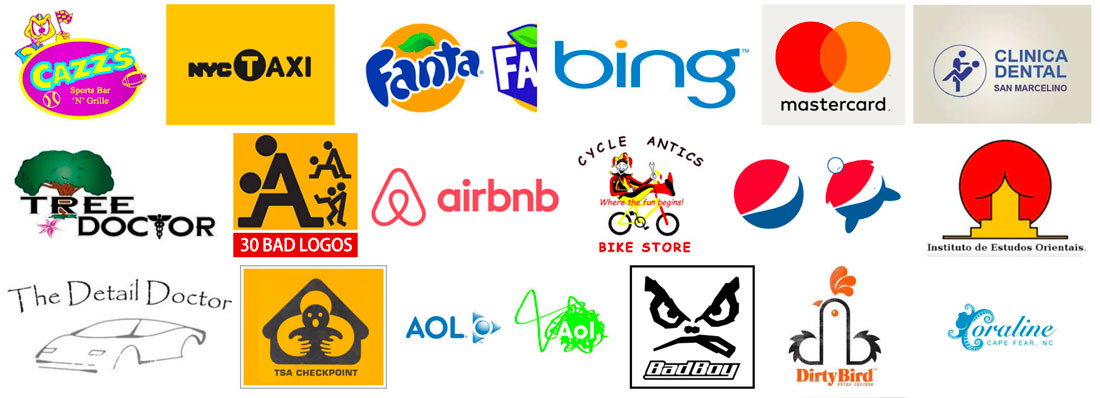
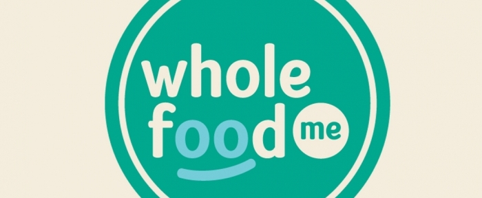
How many times have you walked into a project where the logo is a mess? Bitmap designs. Poor color choices. Lack of contrast. Inappropriate typography. A shape that doesn’t work anywhere. Here’s how to fix a bad logo design. There are so many issues when it comes to bad logo design. And you’ll know one the minute you see it. These poor instances of design tend to stick out like a sore thumb. But is there anything you can do? If the client isn’t in love with the miserable mark, you can make some quick fixes to at least turn the logo into something a little more usable. Here are a few tips (starting with a collage of bad logos!) and examples of quick fixes that can help improve a logo. What Does a Bad Logo Look Like? https://designshack.net/wp-content/uploads/bad-logo-design.jpg You can’t always define a bad logo, but you’ll definitely know one when you see it. 1. Redraw It https://designshack.net/images/designs/wholefood-me.jpg One of the most common “bad logo” problems is inappropriate filetype. There are still people buying $5 logos online and ending up with… well, a $5 logo! These logos are mostly unusable for anything other than small digital applications because they are often small bitmap images. (There’s no way you can use this on a print project or on a large high-resolution screen without it breaking down.) It’s not ideal in any sense of the word. But you can pop that logo in Illustrator and redraw it so that you have a usable vector version to work with. Here’s how I do it in a jiffy: ** Start with the biggest logo file you have and separate the text from the mark. (You can just crop it out.) Ideally, you will have a single color version to work with here. ** Trace the design in Illustrator. Use the highest resolution setting or for simple marks without many colors, use the appropriate color setting. ** Expand the trace and delete any negative space. ** Clean up curves and rough edges manually. ** Add color back to the logo if you used a one-color mark. ** Add the text back, matching fonts as closely as possible. While this might seem like a lot of work for a bad logo, it will turn the design into something usable. This can be useful if you have a client with a poor-quality mark that they don’t want to completely overhaul. 2. Introduce New Typography https://designshack.net/images/designs/5th-note-production.jpg Another common logo problem is the typography. Sometimes the tone of the lettering and mark just don’t match. A simple tweak to the typography can make a big difference. (Sometimes just kerning a couple of letter pairs can fix a jarring logo design.) When selecting typography for a logo make that you are fixing, it’s usually best to stick to simple, readable typefaces. If you are fixing a logo, it probably already has a lot going on. Your goal is to make it less busy and a little sleeker. Experiment with title case and uppercase options until you find the right fit. 3. Tweak the Color https://designshack.net/images/designs/advance-apparel.jpg A dated color palette or one that lacks appropriate contrast can break a logo in an instant. If the mark and typography are sound, consider a palette revision. Most logos only need a couple of colors. Look for options that are rooted in color theory and even science to get something that will appeal to users. (We have our own guide to the science behind color.) The other option is to strip out color altogether. Think about how the logo is used. If it is primarily used with other high-color elements such as photos or bright backgrounds, a black or white only logo might be a better option. This allows the logo to fall into the rest of the design, it helps create visual cohesion and will eliminate that jarring feeling that happens when you force design choices to make multiple high-color elements work with each other (such as dark shadows or boxing). 4. Strip Out Elements https://designshack.net/images/designs/coffee-landia.jpg Many amateur logo designers try to put too many things into the mark, resulting in a bad logo design. The easiest way to fix this type of bad logo is to start stripping elements out. Stick to one iconic or artistic element and one block of text for the logo. Avoid mixing icons into the typography – a way too common mistake – and don’t use clipart to represent your brand. (That’s the quickest way to scream “I have no idea what I am doing.”) When in doubt, a simple logotype can be enough. Use the brand name to create a simple text representation of the brand. Think of how many major companies that you know by a text style – Disney, Coca-Cola, Gap. Don’t force an image element when there’s not a natural solution. 5. Iconize It https://designshack.net/images/designs/mint-elephant.jpg Oversized icons are a fairly trendy design element that can help you streamline a logo. Rearrange the parts in a badge style element with an icon and text. What’s nice about this treatment is that it will force you to think about how to simplify the design. Using a badge-style design will also get the logo into a container of sorts, which can make it easier to use across projects. When fixing a bad logo with an icon style, think about how to make it work as a shape in places where it will be commonly used. Square and round logo shapes are the easiest to work with online since they fit right into the profile image areas of social media pages. This shape can be a little trickier for websites with shallow header areas. With that in mind, you might consider creating a squarish stacked logo and a more horizontal version so that you have options for usage. Conclusion While there’s not a set of defined rules that make a good logo – tastes and trends can vary – most people can spot a bad brand mark. And while you can’t make these marks perfect, a few quick fixes can make them more usable. Work with clients on projects to make the most of what they have, and maybe you can sell them on a brand or logo refresh down the line. Source: https://designshack.net/articles/graphics/fix-bad-logo-design/ See also... https://www.nairaland.com/4421345/nairaland-portfolio-logo-designers-2018 3 Likes 1 Share |
| Art, Graphics & Video › Re: Nairaland Portfolio For Logo Designers 2018 by erad(mod): 1:09pm On Nov 05, 2018 |
DerrickM:So sorry about that bro. Your reply was sandwiched in the middle and I just saw it when I went to check now. Apologies. 1 Like |
| Art, Graphics & Video › Re: Nairaland Portfolio For Logo Designers 2018 by erad(mod): 4:32pm On Nov 01, 2018 |
IRALIFE:No, though I finished from OAU. I generally just live in ife, for now. |
| Art, Graphics & Video › Re: Nairaland Portfolio For Logo Designers 2018 by erad(mod): 6:39am On Oct 25, 2018 |
Olohunjedalo:Ile-ife. |
| Art, Graphics & Video › Re: See These Pencil Drawings by erad(mod): 10:34am On Oct 13, 2018 |
Good job bro... Neat drawings. Try to use better lighting when snapping so the beauty of the works are not ruined by bad camera angles. 1 Like |
| Art, Graphics & Video › Re: Why Professional Logo Design Does Not Cost N2,000 by erad(mod): 9:05am On Oct 13, 2018 |
TruthHurts100:The article isn't mine, The source is attached at the base. |
| Art, Graphics & Video › Why Professional Logo Design Does Not Cost N2,000 by erad(mod): 1:59pm On Oct 12, 2018 |
Logo design in today’s world is totally under rated. People do not understand how important a good logo is and how valuable it is to their business and this is why I am going to outline some very important facts telling you exactly why logo design should not cost $5 and why your logo is not something you should take lightly. In broad terms, I will do this by comparing “cheap logo design” to “professional logo design” and I will outline the reasons why professional logo designers do not charge such low fees and why you should invest in a professional logo design. What Is A Logo? To understand what a logo is meant to do, we first must know what a logo is. A logo’s design is for immediate recognition, inspiring trust, admiration, loyalty and an implied superiority. The logo is one aspect of a company’s commercial brand, or economic entity, and its shapes, colours, fonts, and images usually are different from others in a similar market. Logos are also used to identify organisations and other non-commercial entities. It makes me wonder why people have no logo or why they would even bother with a cheap logo design if a logo is meant to do all of these things? Spec Work & Logo Design Contests https://justcreative.com/wp-content/uploads/2008/05/nospec.gif Before I get onto comparing cheap VS professional logo design I want to talk to you a bit about SPEC work. “Spec” has become the short form for any work done on a speculative basis. ie. You design this for me, and I will pay you if I like it. – This is not right. To clarify, let’s create a scenario in another industry where SPEC work does NOT exist. “I went for a dental check-up yesterday. After the dentist inspected my teeth, she suggested some work to prevent further tooth decay. I told her to go ahead, and if the dental work was satisfactory, I’d be more than happy to pay. She responded that she wouldn’t be able to do that, because she normally provides a service when a fee is agreed upon up-front. I said I’d let her know after I checked in with other local dentists.” This scenario happens in the design industry every day and is seen as very unethical as it is ruining the design industry. A designer should not have to invest time and resources with no guarantee of payment much alike a dentist or any other professional. I do not want to go into this any further as much has been written about it but I would like to say please avoid design contests and spec work at all costs. Logo Design Contests are bad for your business. Period. For further reading on the damage of spec work I have written an in depth article outlining the “pros” and cons of spec work. N2.000 (Cheap Logo Design) Now that we have taken a look at the damage of Spec Work, let us now take a look at what quality you can expect from a logo in between the N2,000 to N72,000 bracket. The particular case I am looking at today is from a N13,000 logo design contest that was held on Digital Point Forums. The “brief” for the logo design project was “Make a logo for the site ‘Spela Piano’. The meaning of that is Play Piano. This is a site where our members can learn to play piano online.” Below you can see the responses from the contest, which one do you think won? https://justcreative.com/wp-content/uploads/2008/03/250.gif You will notice that nearly all of the logos above use free standard issue fonts and don’t assign to the rules of what makes a good logo. Ie. describable, memorable, effective without colour and scalable. Ask yourself these questions in regards to the logos above: * How many of the logos can you describe or remember? * Are these logos effective without colour? * Are they scalable? * Do they gain immediate recognition? * Convey the company’s personality, character or attitude? * Relate to your clients by conveying a feeling of familiarity and credibility? * Have association with quality and satisfaction? I will leave these questions for you to decide. Professional Logo Design https://justcreative.com/wp-content/uploads/2008/03/professionallogodesign.gif Now compare these professionally designed logos and answer the same questions as above…. See the difference? Why are they so different? As outlined in the logo design process of top graphic designers, professional logo designers have an actual design process that involves research, sketching, conceptualising, and reflection and this is why they do not charge $5.00. The design process of a professional logo designer usually consists of: The Design Brief: They conduct a questionnaire or interview with the client to get the design brief. Research: They conduct research focused on the industry itself, on its history, and on its competitors. Reference: They conduct research into logo designs that have been successful and current styles and trends that are related to the design brief. Sketching & Conceptualising: They develop the logo design concept(s) around the brief and research. They use creativity and know how to design a logo. Reflection: They take breaks throughout their design process. This lets their ideas mature and lets them get renewed enthusiasm and receive feedback. Presentation: They then choose whether to present only a select few logos to the client or a whole collection. Celebration: They then drink beer or eat chocolate or sleep or start on next logo design. Or a combination. Do you believe doing all of that costs N2,000? On that note, did you know that the software to make the logo is N252,000 (USD$700) in itself, let alone the computer that it has to be installed onto or the costs associated with the essentials… paper, ink and an internet connection. More Reasons Here are some more responses from other designers on reasons why logo design does not cost N2,000. Tara from Graphic Design Blog outlines in her "6 reasons why a logo should cost more than your lunch" that 1. A logo is the very first impression people get of your company. 2. A logo needs longevity. 3. A logo needs to be original. 4. A logo should look professional. 5. A logo should reflect the time and thought gone in to designing it. 6. A logo is the starting point of your whole corporate image. Now look back at those N2,000 logo designs or your even own logo to see if adheres to the above points. How much does a logo cost? This is the single most frequently asked question, though it is the hardest one to answer without more details of the project. The cost of a professional logo design is a question that cannot be easily answered as every company has different needs, however, the best way to approach this question is to draw up a customised quote for each individual. A number of factors have to be taken into consideration when designing a logo, such as how many logo concepts need to be presented, how many revisions are required, how much research is needed, the size of the business and so on. The best way to find out how much a logo design will cost is to get a quote from the designer them self. Time To Invest? Isn’t it about time you invested in a professional logo design? You can can get a free quote for a professional logo design by clicking here or you may like to look at my logo design portfolio first. You may also like to read the article “how to choose a logo designer?” Do you agree? Does logo design cost more than $5.00? What have you paid for a logo design? Source: https://justcreative.com/2008/05/22/why-logo-design-does-not-cost-5-dollars/ See also... https://www.nairaland.com/4421345/nairaland-portfolio-logo-designers-2018 6 Likes 2 Shares |
| Art, Graphics & Video › Re: 7 Killer Tips For Logo Design by erad(mod): 1:46pm On Sep 24, 2018 |
JeffreyJames:I absolutely agree with you. But can you blame them? When there are so many amateurs out there ready to design crap for peanuts. Unfortunately after these same clients get shortchanged by these amateurs, they then reflect the bad experience on designers in general. All in all, always know your standard and never compromise it for any reason. If you are consistent with what you do, the right people that will appreciate your products will notice you. 1 Like |













1 2 3 4 5 6 7 8 ... 73 74 75 76 77 78 79 80 81 (of 104 pages)